Friday, 13 April 2018

Statement of Intent


Statement of Intent

I am making an advert to advertise Bic stationary, which shows that it can be used by all people and to show that Bic as a brand is inclusive for all people. The TA for my product which I am advertising is very varied. For example, the stationary that Bic produces can be used by everyone as there is lots of stationary they produce e.g. pens, pencils and highlighters. It can be used by students who are in college and university as well as adults who are in work. The advert is most likely going to be aimed at females because of the model being female and the fact that the reason for the advert is International Women’s day, showing the fact that Bic are inclusive for all.

My image is going to be right of the advert with the caption being on the left, both of equal sizes in order to show the importance of both things in my advert. The model will be looking directly into camera and she will be represented as a strong female which breaks the stereotype of adverts with female in where she is represented as weak. Bell Hooks, who is a feminist, would appreciate this because I am breaking the traditional representation of women.

My background will resemble the background on the original advert, which is blurry and out of focus so the model and caption is what is in focus as they are the most important things on the advert.

My advert will appear on places such as the side of buses and train stations so it will be viewed by a large amount of people each day. This will be effective in targeting my TA because, as previously mentioned, it will be viewed by a large amount of people where my TA are likely to be, and as  my target audience is very large and varied, it will be useful where it has been placed.

Backgrounds for my advert

Background Options

This background would be good for my advert because it is similar to the original advert I am using and it isn't too harsh to take away from the picture of the model.


This is also an option for a background for my advert. This is because it is not in harsh focus again so it will not take away from the photo of the model. However, the colours on this are quite dark so it may not be suitable with the photo of my model.


This may be useful for my advert because it is out of focus and this means that the model will be easily visible and the text caption will be also. As well as this, the light colours won't contrast with the photo of the model and the colour of the fonts.


This background is an option as well because of the fact that it is blurred and the colours are light so they will not interfere with the colours of the model and the colours of the font.


This background is also suitable for my advert. It is also blurred so there is no focus on the anything in the background so the focus will be on the model in the foreground. However, the colours are quite dark again which might contrast with the colours used on the model and the font.


This is also an option for the background of my option. This will go with the theme and purpose of my advert, which is to sell stationary. As well as this the background is blurred and the colours are light so they will not cause any contrast with the model and the colour of the font.

Wednesday, 11 April 2018

Advert Research 2

Colgate Advert

The image on this advert is a close up of the model showing just her fact and part of her neck. The model is breaking conventions as she is not looking directly into the camera however she is following conventions as she is smiling. This creates a stereotypical representation of women that she is smiley and happy all the time. The background is a mix of colours, of red and blue which makes the model stand out.
The font is sans serif which means that it is very easy to read. There are varying sizes of the font depending on how important the statement being said is, as well as this, the boldness of the font also is varying. All of the font is white which means that it stands out on the red background. The statement ‘A WHITER SMILE INSTANTLY’ is the largest font on the advert which suggests that it is the most important thing on the advert and is the most eye catching. The font style for the word ‘INSTANTLY’ is different to the rest of the font on the advert which suggests that it is the most important word on the advert and the creator of the advert wants the audience to notice it the most.
The red, white and blue creates a brand identity because those colours are associated with the brand ‘Colgate’. There is also synergy created through the colours as all of the font is in white and the toothpaste tube which is also featured on the advert has red, white and blue on it. As well as this, the logo of Colgate is featured on the advert which is also associated with the toothpaste, and it is known nationally that Colgate is toothpaste.
The purpose of this advert is to sell the toothpaste which benefits the company, Colgate. The buzzword ‘INSTANTLY’ is used which could persuade the audience to buy the toothpaste as it is represented as the best toothpaste to own. As well as this, the whiteness of the model’s teeth could also persuade the audience to buy the toothpaste because the advert gives the suggestion that the toothpaste will result in your teeth being as white as hers, so people will want to buy it.

Advert Research 1

Bic Advert


The image on this advert represents the woman as being strong. This is shown by her stance and how she is looking directly into the camera and smiling. The image is a medium show of the model as it is showing the head and shoulders of the model. The background is out of focus and white means that the image which means that everything in the foreground stands out well and is easily seen.

The font on this advert is serif which means that it has curves however it is easy to read and stands out well on the advert. The fact that it is quite a large font also means that it is easy to read and it stands out well on the background. As well as this, the fact that the font colour is black on the white background it stands out well on the white background. The statements on the advert are all short and snappy, and are all interconnected which creates a positive representation of the brand as it shows that they are inclusive of all people.

The brand Bic is a popular brand for stationary and this advert is showing how females can be represented. There has been a brand identity created through the colour yellow, which is associated with the brand Bic. As well as this, the logo also creates a brand identity because it is associated with the brand and people know what the brand is, mainly just for the logo.

The reason for the advert is International Women’s Day which is a positive reason behind the advert which shows how Bic is inclusive of all people and means that the advert will be positive for the brand and could improve sales of products made by Bic.

Thursday, 8 February 2018

History of Radio

History of Radio
1890 – The birth of radio
1892 – Scientist Nikola Tesla experimented with radio energy for communication
1895 – Guglielmo Marconi built a wireless system to transmit signals over long distances
1890 – The US Army established a wireless communication system
1901 – Guglielmo Marconi conducted the first successful transatlantic radio communications
1901 – A radiotelegraph service was set up between five of the Hawaiian Islands
1906 – Reginald Fessenden made the first radio broadcast with audio


1920 – The first radio station, KDKA in Pennsylvania, was created

1927 – The Radio Act of 1927 required radio stations to operate in the publics best interest


1930 – The Galvin Corporation introduced the first commercial car radios
1933 – Edwin Armstrong created FM Radio
1933 – FDR used radio to broadcast Fireside chats to America during WWII
1938 – CBS broadcast of Orson Welles’ War of the Worlds led to nationwide hysteria


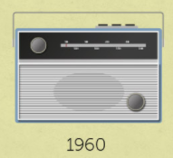
1954 – Regency created the pocket transistor radio


1963 – The first radio communication satellite Telstar, was launched into space


1990 – The birth of internet radio


 2002 – Tuneln begins bringing radio to the world  


Monday, 20 November 2017

TA Research of my Images


Target Audience Research of my Images

This image included the school building and part of the courtyard with the benches. The comment from my target audience praises the uprights I’ve managed to keep straight.

This image had was of a flower in the library with the background blurred. My target audience complimented the focus I had of the flower being the main focus and the background being slightly blurred.

This image was again outside including the school building and the benches. My target audience believed there was too much foreground which I agree with because I was stood too far back from the subject I was intending to photograph.

This image was up to stairs with a lead in line. My target audience appreciated the lead in line I had here and the texture that I included in the photo such as the banister creating the lead in line. They have also given me something to work on in the picture to make the composition more pleasing for my target audience.

Thursday, 16 November 2017

Selection and Rejection of Photographs 1


Selection and Rejection of Photographs


This is a good photograph because the lighting and angle is good. It’s simplistic and doesn’t have a main focus but shows good space and perspective of the intended image. There are good colours throughout with the different shades of blue alongside the white and cream as well as the picture on the wall which adds a contrasting colour of red to the image. This was taken from the top floor looking down onto the second floor.


This is one of my best photographs because of the way the main component of the image is completely in focus and the background is blurry. There is also the good contest of colours with the green on the yellow and pink. It has a good foreground and background, with the well contrasting colours. There is a very different colour scheme for the foreground and the background with the yellow and green for the main focus of the image and the blues and creams for the background of the image. This was taken in the library.


This is also one of my favourite photographs, again because of the simplicity of it. There is a good lead in line to the top of the stairs. It is also a diagonal line which draws the viewer into the picture. The colours are also very simplistic with nothing too flamboyant to draw away from the lead in line. This was taken looking up the first floor stairs.


This is one of my not so great pictures because of the shadow from the book case which takes away from what I intended to have the image of. I intended to have a diagonal leading to the books however due to the shadow and standing too close to the bookshelf which made the diagonal no as prominent as I wanted it to be. This was also taken in the library.


This is also not one of my best photos because I took it out of a window so there is the shadow of the inside as well as the window sill which takes away from the intended effect. Also, my camera is facing slightly to the left of where I wanted the picture to be taken so the subject is slightly to the left and half of it has been cut off which takes away from the effect that I wanted. This photo was taken on the top floor looking out onto the roof.


This is finally again one of my worst photos. This is because of again the fact that I cut half of my subject off. The way I positioned the camera means I that I didn’t get what I actually wanted to on the picture and didn’t get the intended illusion. I was meant to be looking right down to the bottom floor as this was taken on the top floor and wanted to include the ‘Maths’ logo but the camera position wasn’t right. To improve this, I could have taken multiple pictures moving the camera slightly each time. 


Friday, 27 October 2017

Levi's Advertising

Levi’s Advertising


How is America and American teenage life represented in these adverts?

America and American teenage life is represented to be exciting and fun in these adverts, especially the first one as it is all about different cultures and how everyone can be united by one thing such as the different jeans worn but the people. The second advert also presents American teenage life as exciting too cause of the party they have attended and how they two people are wearing the same jeans and that is what they have been connected by.

Why/ how might this representation be seductive or attractive to teenagers living in Britain?

These adverts might be attractive to British teenagers because it shows how these specific genes can change your life and connect people all around the world by a simple item. Also, it can look attractive to British teenagers because of the cultures that are dancing together which could encourage British people to wear and buy the jeans if they want to be able to act and dance like the people in the adverts,

Do you think adverts like this erode cultural differences? Give reasons for your answers.

I do think adverts like this erode cultural differences because, as I have mentioned previously it connects people by simple things such as a pair and jeans and shows how there isn’t many differences between people and everyone can get along. This is typically shown in the first one because it shows how cultures all around the world use these jeans to connect with each other because everyone is the same inside.

Thursday, 12 October 2017

Analysis of Bauer Media


History of Bauer Media


“The business became part of the Bauer Media Group, Europe’s largest privately-owned media group, in 2008. Founded in Hamburg in 1875 and now in its fifth generation of family ownership, the Bauer Media Group operates in 19 countries including the UK, Germany, Poland, Australia, New Zealand and the USA and has 11,000 employees worldwide.”


In the UK, Bauer media reaches over 25 million people. The media forms that they use are magazines, digital, radio and TV.


Homepage


In the center of the homepage there is a montage of constantly changing images advertising the different media forms that they use.


There is also the amount of people that this media company applies to and it shows that there is a mass audience that this applies to and there are lots of different brands that Bauer Media have. Because there is such a large audience this reaches there is likely for there to be brands that apply to niche audiences and mass audiences alike.


The mast head is on the slides and it stands out on the background which follows the convention of having a masthead that stands out to show what it is.


This is one of the advertisements for one of the mass media brands that is included in Bauer Media because it is very well known all over the UK and appeals to a large audience.


This is aimed at a niche audience because not many people listen to this radio station compared to how many people reach Bauer Media. Not many people have heard of this radio station and the people that listen to will be loyal to it.


The colour scheme for the home page is blue and white, with the main headings being blue font on a white background and then the links being on a blue background with white font.


 Genre of Texts
The genre of the texts varies throughout Bauer because of the different media forms it includes. For example, the genre of texts about classic cars will be very different from the genre of the texts that appear in the mother and baby link.


Audience
Again, because of the mass audience that this media station applies to, the audiences also vary depending on what media form you are looking at. Some of the media forms are aimed at niche audiences who only have a small audience who are loyal to them and who know a lot about the certain top e.g. country walking. However, some of the media forms have a mass audience with a large amount of people listening/watching/reading about them e.g. 4 music.
Also, Bauer Media reaches a large audience because it has included social media links and contact details which everyone can access so it will be available at all times for people to access.

Furthermore, there is a section on Bauer Media where you can select your age and gender and you will be generated a selection of media forms on the website which may appeal to that particular age and gender.

Website

My website address is   https://marthareid2.wixsite.com/jesuis   Homepage Linked Page: Fashion ...